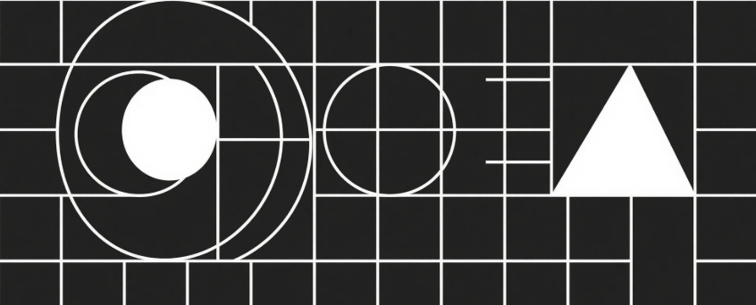
Great design isn’t about using fancy tools or trendy aesthetics — it’s about making sure your message is delivered clearly and consistently. These 4 principles are often overlooked, but they can dramatically improve your visual output:
1. Visual Hierarchy
Make it obvious where the viewer’s eye should go first. Your headline, subtext, and call-to-action should be organized by size, weight, and placement. Think big > medium > small.
2. Consistent Alignment
Align elements neatly using grids or smart guides. Whether it’s left-aligned, centered, or right-justified, consistency creates order and helps people process your design faster.
3. Smart Contrast
Contrast isn’t just about colors — it also includes font weight, size, and spacing. Strong contrast draws attention to what matters and improves readability.
4. Intentional Spacing
White space (aka negative space) is your best friend. It gives your design room to breathe, reduces visual clutter, and adds a sense of elegance.
Want stress-free, high-quality design for your business?
At Miloqu, we help modern brands maintain visual consistency across all platforms — without the headache of managing freelancers or in-house teams.
With one simple subscription, you get access to a full creative team ready to deliver beautiful, effective visuals that grow with your business.
🔗 Learn more → https://miloqu.com