Color isn’t just a visual element — it’s emotional. The colors you choose for your brand can influence how customers feel, what they remember, and whether or not they trust you.
Here’s what you need to know about color psychology and how to apply it effectively:
-
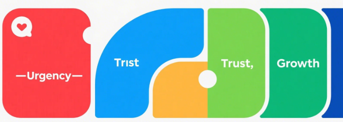
Red: Bold, Energetic, Urgent
Use red for calls-to-action or to spark emotion. But be careful — too much can feel aggressive. -
Blue: Trust, Stability, Professionalism
Often used by finance, tech, and healthcare brands. Blue is calming and builds credibility. -
Yellow: Optimism, Warmth, Attention-Grabbing
Best for youthful, creative, or friendly brands. Great for drawing attention — use in moderation. -
Green: Balance, Growth, Nature
Ideal for eco, health, and wellness brands. It’s also a go-to color for “positive action” buttons. -
Black & White: Luxury, Simplicity, Timeless
Used for minimalist brands or premium feel. Combine with metallics (gold/silver) for elegance. -
Purple: Creativity, Imagination, Royalty
Good for beauty, spiritual, or visionary brands. Adds a sense of uniqueness or mystique. -
Orange: Fun, Friendly, Action-Oriented
Great for e-commerce or SaaS — builds energy without being as aggressive as red.
How to Apply This to Your Brand:
-
Choose 1 Primary Color: The main vibe of your brand
-
1–2 Accent Colors: For contrast or emphasis
-
1 Neutral Base: For balance (gray, beige, black)
Tip: Color perception varies by culture. Always test with your target audience.
🎯 Want your brand colors to not only look beautiful, but also convert better?
At MILOQU, we help brands design with strategy — from visual identity to full-scale campaigns.
All-in-one creative subscription: Design. Development. Marketing.
Start here → miloqu.com