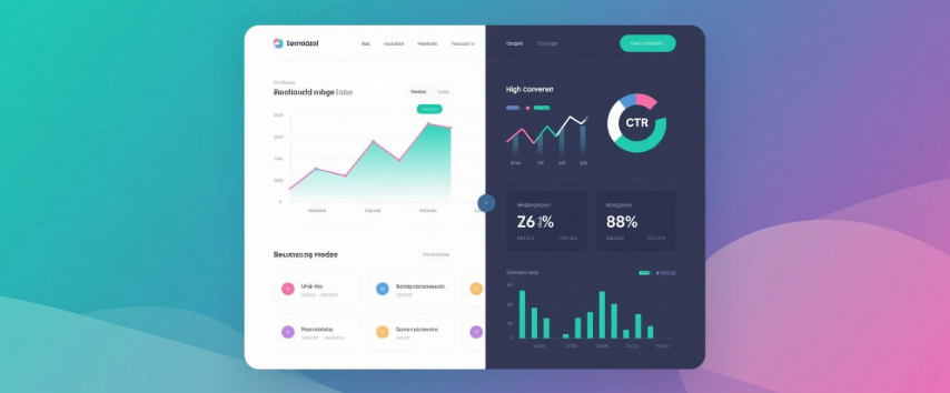
You can have the most beautiful website in the world, but if no one clicks the CTA, fills out the form, or makes a purchase — the design failed.
Designing for conversion means blending aesthetics with strategy. It’s not just about how things look, but how they work to guide behavior.
Here’s how to shift from “just pretty” to “pretty effective”:
-
Visual Hierarchy = Guided Attention
Use size, contrast, spacing, and positioning to guide users through content. The CTA should stand out naturally. -
Keep It Simple (Really Simple)
Remove unnecessary elements that distract. Clutter kills conversion. Give breathing space (aka white space) so users focus on what matters. -
Clear, Consistent CTA
Use a single, bold call-to-action per screen. Repeat it in key areas. Make it descriptive: “Get Started Free” is better than “Submit”. -
Speed & Performance
A slow site = lost conversion. Compress images, lazy load non-essential elements, and use lightweight animations. -
Mobile-First Always
Design for the thumb. Ensure CTAs are tappable, forms are short, and text is readable on small screens. -
Emotional Triggers
Use testimonials, trust badges, social proof, and microcopy to build confidence and reduce friction. -
Test & Iterate
Good design is never done. Use A/B testing and heatmaps to see what actually works — and refine it.
🎯 Want your website or landing page to not just look beautiful but convert better?
With MILOQU, we design with intent. Every layout, every CTA, every interaction is backed by strategy — not guesswork.
Design. Development. Marketing — all in one smart subscription.
Let’s build something that works → miloqu.com