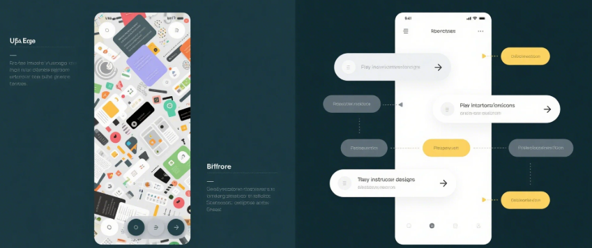
Design isn’t just about making things look good—it’s about making things work well.
If your UI feels messy, overwhelming, or hard to navigate, chances are it's not a lack of creativity—it’s a lack of structure.
Let’s fix that.
Here are simple rules to turn cluttered interfaces into clean, user-friendly experiences:
🎯 1. Limit Your Color Palette
Too many colors = visual noise. Stick to 2–3 primary colors, plus 1 accent. Use them intentionally to guide users, not decorate randomly.
🎯 2. Embrace Whitespace (Don’t Fear It)
Whitespace isn’t empty—it’s breathing room. It creates clarity, improves legibility, and makes your UI feel calm instead of chaotic.
🎯 3. Create Clear Visual Hierarchy
Make it obvious what’s most important. Use size, weight, and contrast to highlight key elements like headlines, CTAs, or key data.
🎯 4. Align Everything
Misalignment is one of the fastest ways to make a UI feel amateur. Stick to grids, snap elements together, and group related items.
🎯 5. Reduce the Number of Elements
Clarity comes from restraint. Audit your screens: what can you remove without hurting the experience? Chances are, a lot.
🎯 6. Use Consistent Components
Consistency builds trust. Your buttons, cards, and forms should feel familiar across screens. Reusable components = clean code & clean UI.
🎯 7. Make Interactions Predictable
Users love clarity. Avoid unexpected behaviors or hidden functions. Instead, create interfaces that are intuitive, fast, and forgiving.
⚡ Final Tip: Start with intention. Every pixel should have a purpose.
—
Design that’s clear and focused leads to better engagement, faster decisions, and happier users.
Need help simplifying your brand’s UI without sacrificing style?
Let MILOQU handle the Design, Development & Marketing—all in one subscription.
🔗 Learn more: https://miloqu.com
