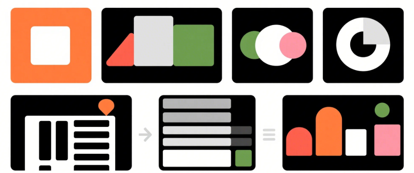
7 Visual Hierarchy Hacks to Instantly Improve Your Layout
Ever wonder why some designs just “feel” right while others seem cluttered or confusing?
That’s visual hierarchy at work.
It’s the silent force that guides your eyes to what matters most. Mastering visual hierarchy means creating layouts that are clear, balanced, and irresistibly clickable. Whether you're designing a landing page, mobile app, or Instagram post—these 7 hacks will instantly upgrade your work:
✅ 1. Start With a Clear Focal Point
Every design needs an entry point. A headline, an image, a CTA—make it pop. Use contrast, size, or whitespace to say “Hey! Look here first.”
🔧 Pro Tip:
Your focal point should align with your primary goal. If it’s a “Buy Now” button, don’t let it compete with decorative visuals.
✅ 2. Use Size to Signal Importance
Big elements get noticed first. That’s just how our brains work. Use larger font sizes and bolder visuals to prioritize what matters.
🔧 Try This:
Create a consistent scale system (e.g., H1 > H2 > Body) to avoid visual noise.
✅ 3. Master Spacing & Whitespace
Whitespace isn’t empty—it’s clarity. Generous spacing between sections and elements allows your layout to breathe and improves legibility.
🔧 Rule of Thumb:
Use more spacing than you think you need. Crowded layouts instantly lose hierarchy.
✅ 4. Leverage Color & Contrast
Use color to guide attention, but don’t go overboard. A limited color palette with high contrast between key elements and the background is a winning combo.
🔧 Bonus:
Use one accent color for calls to action—this helps build consistent attention cues.
✅ 5. Align & Group Strategically
Elements that are aligned and grouped feel connected. Use grids, consistent margins, and proximity to create visual relationships.
🔧 Pro Tip:
Avoid "floating" elements. Every piece should visually belong to a group or section.
✅ 6. Visual Flow: Top to Bottom, Left to Right
Design layouts that follow natural reading patterns (like the F-pattern or Z-pattern). This makes content easier to scan and digest.
🔧 Try This:
Place CTAs at the end of a visual flow to maximize action after context is understood.
✅ 7. Use Typography with Intention
Typography hierarchy (H1, H2, body, captions) isn’t just for structure—it’s for clarity. Pick 2–3 fonts max, and create a hierarchy using size, weight, and spacing.
🔧 Bonus Tip:
Use bold sparingly—it loses impact when everything is emphasized.
💡 Final Thoughts
Visual hierarchy isn’t about flashy design tricks—it’s about communication. When used right, these principles reduce friction, increase engagement, and make your layout actually work for your audience.
Need help designing scroll-stopping layouts?
Let our team at MILOQU handle your design, development, and marketing—all in one subscription.
👉 Learn more at https://miloqu.com